
This solo project was created to explore how mobile UX/UI design can support working parents in finding and enrolling their children in after-school programs.
The goal was to reduce stress and empower parents with visibility into their children's after-school experiences.
Role
UX/UI Designer
UX Researcher
Tools
Figma
Miro
Timeline
6 months
Note: Although this was a solo, self-initiated project, client timelines, development handoffs, and stakeholder meetings were actively considered throughout this case study to reflect real-world UX processes.

Working parents often struggle to find reliable after-school programs, register quickly, and stay informed about their child's day. Existing systems are fragmented and outdated, requiring manual coordination and leading to stress, confusion, and missed opportunities.
To better understand user needs and validate assumptions, I conducted three in-depth, 1:1 interviews with working parents of children aged 2–11. The participants came from diverse professional backgrounds and used a variety of after-school care options - including school-based programs, private daycare centers, and informal caregiver arrangements such as neighbors or family.
The goal was to uncover common pain points, frustrations, and unmet needs in how they currently discover, enroll in, and manage after-school care.
Below are the key themes that emerged:


Working parents face growing challenges balancing full-time jobs with early school dismissal times - often resulting in stress, job compromises, and financial strain. To validate the problem space further, I reviewed recent findings from The Guardian and the Afterschool Alliance, which confirmed three core issues:


These findings reinforce the need for solutions that make after-school care easier to discover, compare, and access - reducing parental stress while supporting their work-life balance.
To better empathize with my users and design a solution that truly fits their needs, I created a user persona based on insights from the primary and secondary research. This persona captures the goals, behaviors, and frustrations of a typical parent navigating after-school care challenges.

To connect research insights with the real-world user experience, I mapped out a typical parent’s journey through the after-school care process - from recognizing the need for support to becoming a loyal, returning user. This journey highlights the emotional highs and lows parents face as they try to find reliable care while balancing busy schedules. It also reveals clear opportunities where thoughtful UX improvements could ease friction, build trust, and reduce stress.
The following journey reflects Miranda’s experience and illustrates where the product can step in to simplify key moments:

To better understand the current digital landscape for after-school care, I conducted a competitive audit of existing platforms serving parents, schools, and care providers. This audit helped identify what’s working, what’s missing, and where this product could stand out.

Key Gaps Identified:
Opportunities for Differentiation:
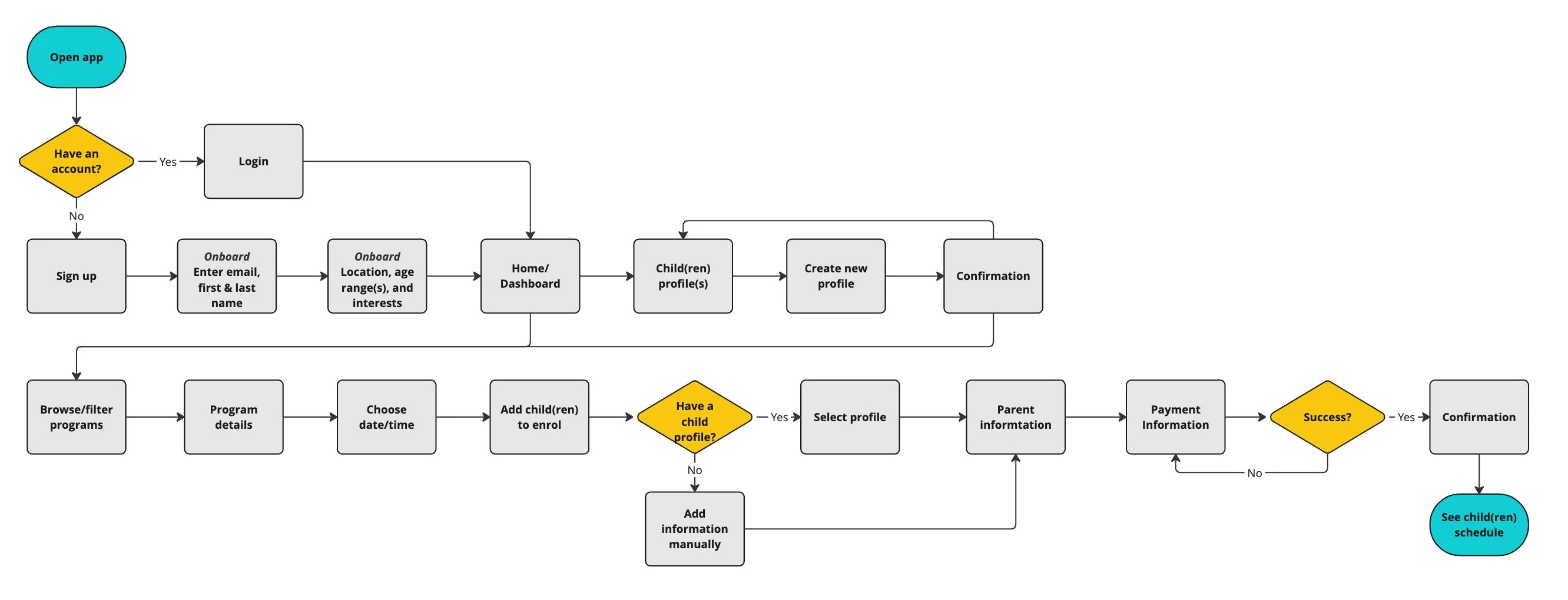
After synthesizing user research and identifying core needs, I mapped out the information architecture to ensure a clear, intuitive structure that aligns with real parent workflows. The goal was to reduce cognitive load and minimize the steps it takes to complete key tasks like enrolling a child, browsing programs or checking their schedule.

The accompanying user flow visualizes the step-by-step journey a parent might take - from onboarding onto the app, to seamlessly enrolling in and paying for a program - making sure the path is straightforward, efficient, and designed for busy lives.
To address the question - How might we simplify after-school care enrollment while supporting parents’ decision-making? - I focused my ideation on one critical touchpoint: the homepage experience. Since the homepage is a parent’s first interaction with the app, I explored six quick-flow sketches to determine the most intuitive entry path into enrollment.
Each idea tested different ways to balance guidance, flexibility, and ease of use. I ultimately selected Idea 6 for its balance of personalization and simplicity - starting with a prompt to add a child’s profile first and then begin selecting a program to enroll in felt natural for parents and created a tailored path from the start.

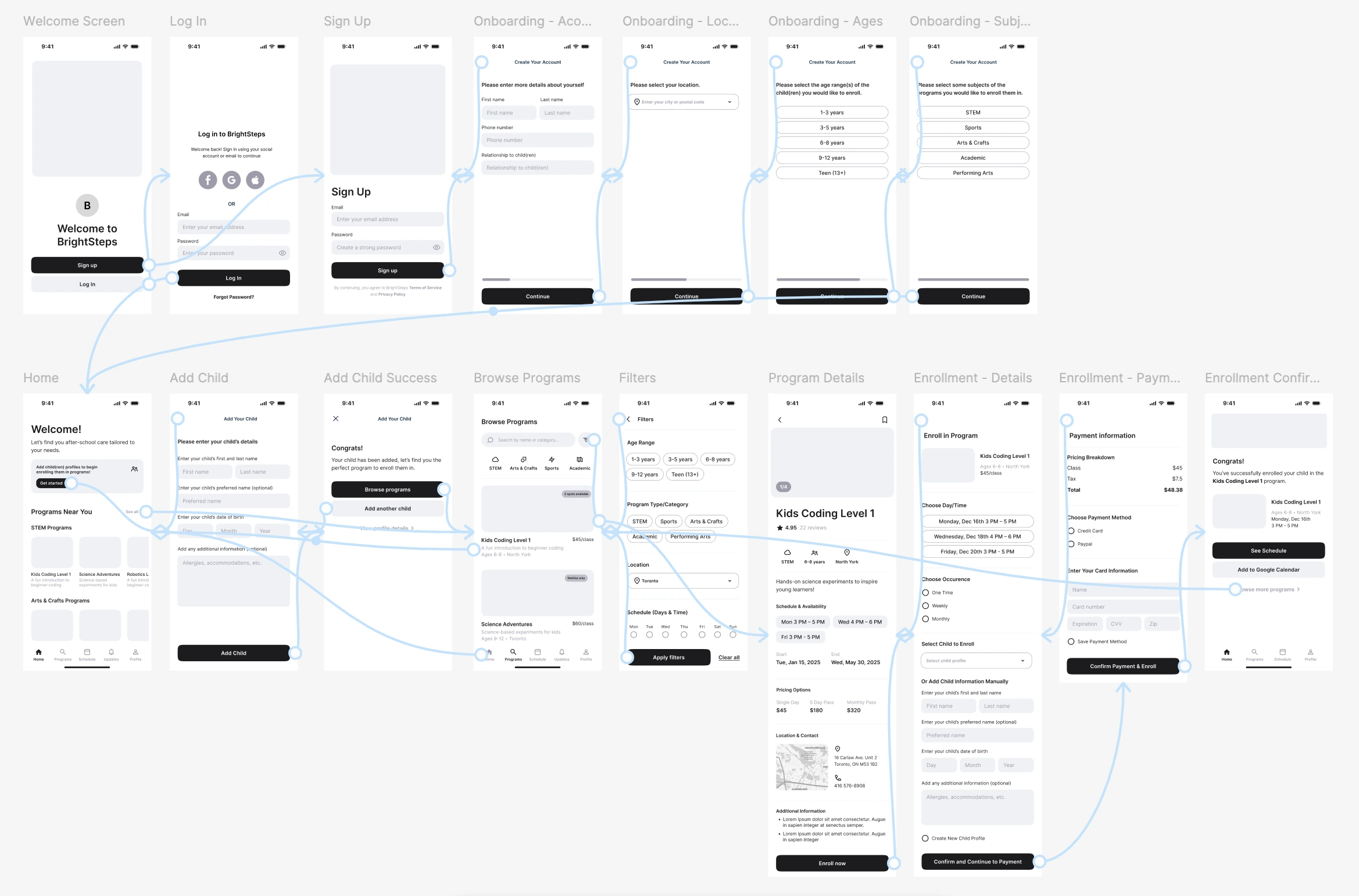
To bring the experience to life, I created wireframes for the end-to-end parent journey - from onboarding to program enrollment. The flow includes key screens such as: onboarding, adding a child, browsing and filtering suggested programs, viewing program details, and completing enrollment and payment. These wireframes helped visualize how each step could reduce friction, support decision-making, and create a seamless path for busy parents.
To assess how well the app supported busy parents in finding, enrolling in, and paying for after-school care, I conducted four usability tests - 2 moderated and 2 unmoderated. Participants were asked to complete core tasks such as signing up, adding a child, browsing programs using filters, exploring program details, and completing an enrollment and payment.
Through these sessions, I gathered valuable insight into how parents interacted with the experience - from intuitive flows to points of friction and hesitation. I then organized feedback into key themes (e.g., navigation, filters, terminology, and enrollment flow) using an affinity mapping process.

Based on insights from usability testing, I made several key improvements to enhance clarity, usability, and trust across the app experience. These changes were focused on:
Each refinement directly addressed user pain points and helped streamline the app’s core flow - from onboarding to enrollment - making it easier for parents to confidently complete key tasks.
UI & Terminology Iterations:


UX & User Flow Iterations:


High Fidelity Mockups:
Interactive Figma Prototype:
After refining key flows based on usability feedback, I moved into high-fidelity UI design - aiming for a clean, approachable, and trustworthy interface for busy parents.
The visual identity strikes a balance between clarity and a kid-friendly theme:
To ensure consistency and scalability across the product, I created a simple, reusable, modular design system. It includes core components like buttons, input fields, and cards, along with a defined color palette, typography styles, and spacing rules. This system made it easier to maintain a cohesive look and feel while speeding up the design and handoff process.

If this were a real-world product, here’s how I would approach product development in collaboration with PMs, developers, and stakeholders:
Accessibility was a key consideration during the design process. I intentionally chose a color palette with sufficient contrast, ensured legible font sizes, and designed for intuitive, tap-friendly interactions. If developed further, I’d continue to prioritize:
I’d also plan for edge scenarios to make the experience robust and scalable:
I would build a shared design system using an atomic token-based approach to standardize components, color, spacing, and typography. To ensure smooth handoff to developers, I’d include:
BrightSteps would serve two main user groups:
If launched as a real product, BrightSteps could expand to include a customer-facing portal with features like:
To evaluate the effectiveness and impact of the product experience, I would track the following key metrics:


Collaborate with Product Managers and Product Owners to prioritize future features like:
This approach would ensure BrightSteps not only meets users’ immediate needs but is also positioned to grow as a robust, scalable product.
This project allowed me to dive into a very real and emotionally charged problem space: helping busy parents navigate after-school care options with confidence and ease. Although this was a solo exploration, I intentionally approached it with a real-world product mindset.
Key takeaways:
If I were to continue developing BrightSteps, my next focus would be to validate assumptions, gather deeper insights, and broaden the product’s capabilities:


